The title sequence is for a long time running documentary called Poems for Edda which talks about Norse Mythology. The t.v show is weekly with every episode running for 1 hour.Every week the show talks about one specific topic within the mythology.
Boxes and Type

these are the boxes. they are the size of a small shoe box.
as for type it was also “hand made”. where i printed out a plain grid and started lettering using the old norse text as an inspiration

")

after I hand drew the letters, I put them on Illustrator and traced them.

Scene 5

Here the idea is books and a pen because Norse mythology was told by poems and all those poems came to make “Poetic Edda” which is a collection of norse poems.
the process of making this was the same as the rest.
but here the different is i used same baxkgound as the tears scene but played around in photoshop with it


Scene Four

this scene represents Freya’s Tears where she cried tears of amber over the lose of her husband.

This scene is also done the same way as the rest with photo of background and animated objects on top.
 This is the backgound than the tears were drawn but for this scene I played around in photoshop to make them “amber” and adding a pattern on them.


Scene Three

This scene represents Yggdrasil which in norse mythology, is the tree of life and the tree the holds the worlds with its branches. so unlike the other scenes its not as dark.


also in other images it it depicted with light “heavely” colors of green and blue. so I decided for this scene to show a part of the tree’s branches and use the same “heavenly” colors.
At first I played with clay but ended up making it like the rest in a small box with crumpled paper. but with this one I first used a color too bright for the tree branch which later on I had to adjust on photoshop

![threeee]](https://danaalhamad.files.wordpress.com/2016/02/threeee.jpg?w=371&resize=371%2C247&h=247#038;h=247 "threeee]")
 r
r
then like the rest, the animation was done on after effects.
first one looked like this where the type were too far apart and hard to read.

bur after that I fixed it to make it better

Scene Two

This scene represents Odin’s ravens who roam the world and act as Odins “eyes” by seeing everything. So I looked at ravens eyes to see how they look like


the process of making this was the same as the rest where i played with paper and glued it inside a mini box and made the eyes out of paper.


after that I played around with photoshop and cut off the eyes to animate them on After Effects.
Scene One

This scene represents the event in norse mythology as Ragnarök. It is the event where the gods fall and the world is ending. So when I looked for images to depict it I found these.


There is fire , weapons (spears) , giants and wolfs. so I took out the two elements of it, the fire and spears and included in my scene. I didnt included giants or wolfs or anything else because I don’t want my title sequence to be too literal of the event and the details of it, instead I just wanted to give hints.
So to make this, I got a mini box, where I painted it and added layers of paper to make the background.

this is my first try with it. I crunched up the paper and make the spears with wood. but I noticed the paper didn’t give off a sense of “fire” aside from the colors and the spears were just laying there and was hard to animate this way. so I redid the background

made the fire using abstract shape ( triangl ) and I drew the spears on a paper

put it on photoshop to edit it and than moved on to Adobe After Effects

where I played with opacity and position.
than final step was playing around with brightness and contrast effects on Premiere

Internship


3D print project with Character design.
creative process
This is a 3D project I did last semester. To come up with the character I started looking at random words and then I started to mix them to see what I would get. So my first step was sketching and I used the words “Bunny, skeleton , plant and deer”


These were my sketches. Then I started to work on 123Design and I tried out many ways to do this in 3D. At first I tried out flat but then I thought that it did not look very good.


So I tried doing it more rounded, but it was still too flat and so the ears ended up being weak.

In the end i did it again but I made it even more 3D by making the face round.


and so it worked a lot better and every part was stuck on the head perfectly. The last step was painting it and putting it together.


I wanted to make it more mixed media so I made the flower petals from bending paper and I painted it and added glitter.
Other works:


Collaboration and team work

Collaboration and team work


Final Reflection
In this class I learned a lot of technical skills of how to set up a file properly to print. At first it was hard but after doing it over and over again it just becomes a habit.
Package
for the package first thing we needed to do was set up the template and give it a bleed. we do that on illustrator by pressing “Off set path”
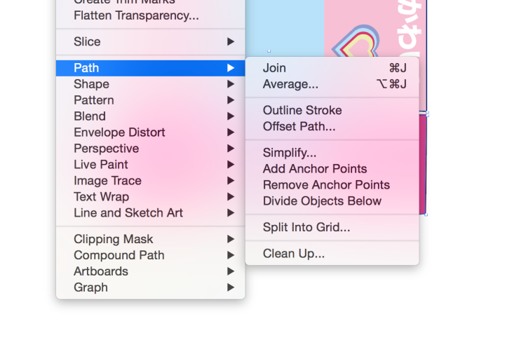
and that way we create the bleed for the package.
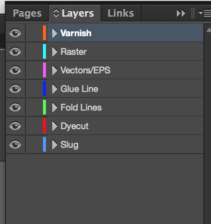
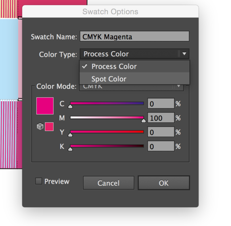
then for the die cuts , folds, glue lines and varnish we use spot colors to distinguish those and before i thought pantone colors were the only spot colors but then I learned I can turn any color into a spot color
also in packaging it is important to set up the layer where the diecut, fold line and glue line are way at the bottom while varnish goes on top